Finch
Invoices and Client Payment
Overview
Problem:
Finch’s startup co-founders need a working prototype to bring their product vision to life.
Goal:
Create the initial web-based app for Finch’s primary users: attorneys and their clients.
Solution:
Designed the MVP which successfully displays the product’s vision and serves as a working prototype for both user journeys.
01. Project Overview
Legal firms spend time on tasks, such as collections, that often do not result in direct profit. Finch’s goal is to provide firms with client payment assurance in order for attorneys to focus their time on billable hours.
To present the product to investors, the co-founders need a working prototype to bring the product vision to life.
02. Project Scope
Before the project started, I was given access to Finch’s branding kit, style guide, and product vision sketches. There were no pre-existing wireframes or prototypes.
My work was centered on designing the attorney and client interfaces. The project timeline consisted of 6 weeks to complete the design, which included discovery, ideation, and production.
The goal was to get a prototype built as soon as possible to give potential stakeholders the opportunity to provide feedback. Therefore, we did not conduct user testing in production.
03. Roles & Constraints
I worked individually to carry out the design of the project. Standup meetings with the co-founder were conducted in a virtual environment using the following tools:
- Trello: Project Management Tool
- Excalidraw: Team Workshop Space
- Figma: Asset Creation & Prototypes
- Google Suite: Meeting and content sharing
04. Users & Audience
Finch has three user groups: legal firms, their attorneys, and their clients. Considering attorneys and clients stem from the firm itself, I collected data surrounding Finch’s firm target audience.
Firm Target Audience:
- Attorney Firms: 1-30 attorneys (small to medium sized firms)
- States: MA, NY, CA, FL
- Focus areas: employment, real estate, family, estate planning, general practice
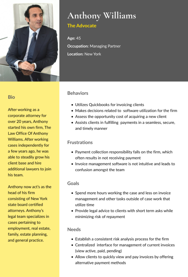
Using information from research and provided by the co-founders, I assembled the following persona to help guide design decisions.
05. Problem Statement
The project’s goal was to create the initial web-based app for Finch’s primary users. This resulted in two user flows to design: invoice management for attorneys and client payment for their clients
Attorney interface to add invoices, assign them to clients, keep track of payments and service agreements.
The firm’s client interface to pay their invoices with payment plan options.
06. Approach
Our approach included the following phases and deliverables:
Discovery
Domain Research
Task Flows
Ideation
Sketches
Lo-Fi Wireframes
Production
Hi-fi Wireframes
Converged Prototype
UI Adjustments
Discovery
Domain Research
Finch is targeting an untapped market in the legal industry which means no direct competition. However, there are a variety of tools small to mid-sized firms utilize which offer valuable insights towards the design. The main takeaway was that all of these tools made use of a “home” or “dashboard” screen which consisted of a summary of data found elsewhere in the interface.
While researching a variety of client payment tools, I found consistencies surrounding the importance of an intuitive and simple interface, multiple payment options, and a seamless and secure payment experience.
Task Flows
Given there was no existing version of the interface, my next step was geared towards understanding the two main user’s work flows.
Working closely with the co-founders, we established the following task flows:
Ideation
Lo-Fi Wireframes
After exploring ideas, I began to wireframe the basic screen structure of the invoice management interface.
Taking concepts created in the invoice management flow, I shifted my focus on the client payment dashboard.
Hi-Fi Wireframes
After getting feedback and completing iterations on low-fi wireframes, the co-founders were ready to scale up into high-fidelity.
In this iteration, I built the overlay screens for adding new clients, invoices, and service agreements. The addition of tags would allow for attorneys to customize and organize their clients.
For the client payment flow, I incorporated the payment options to pay in full or enroll in a payment plan. I also minimized the amount of payment steps to remove barriers for clients to complete payments.
For these designs, I utilized Finch’s style guide and incorporated additional colors for tags keeping accessibility in mind.
Converged Prototype
Once clearing the hi-fi designs with stakeholders and notating minor adjustments, I began prototyping both flows. Starting with the attorney’s invoice management screens:
The co-founders decided to use payment integration software to allow clients to securely add their bank information for payment. For purposes of the prototype, we integrated Plaid into the client payment flow:
UI Adjustments
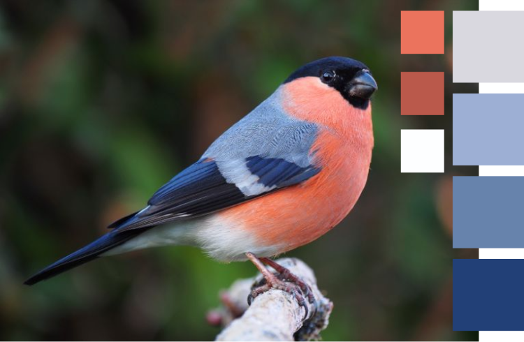
Once the prototype was complete, the co-founders encouraged me to test out additional color palettes. Since Finch is in early stages as a company, they are not yet committed to the style guide originally provided. I began exploring different color combinations on the existing designs and eventually was inspired by the Eurasian bullfinch.
This color scheme allowed for a vibrant yet sophisticated feel to be applied to the site. This allows Finch to diversify its brand from other legal service tools while remaining professional.


07. Solution
The goal of the project was to create a high fidelity web-based prototype for Finch’s two primary users: attorneys and their clients.
My design successfully displays the product’s vision and serves as a working prototype for both user journeys. The invoice management flow incorporates a clear content hierarchy starting with an overview of the most important information on the dashboard. Similar layout and components are used in each screen to maintain consistency and ease of use.
The client payment flow incorporates similar UI styling as the attorney flow to offer a uniform brand experience. In this flow, clients are directed to the payment screen from an outstanding invoice email link notification. Given this is the primary action Finch wants users to initiate, this content is purposely made most prominent to eliminate unneccesary steps and promote payment completion.
08. Outcomes
Despite the tight time frame, I was able to successfully design and complete prototypes for Finch’s two main user groups. In the end, the co-founders were happy with the designs and plan to utilize the assets to help secure funding.
Reflections
This was my first time working with an early stage startup which offered unique challenges and new opportunities to grow as a designer.
Since this project was focussed on creating Finch’s initial MVP, the design process had to start from scratch. In my previous work, I had access to existing screens or wireframes for reference. So my main challenge was starting the project without any pre-existing UX design assets. I saw this as an opportunity to create a solid foundation for Finch’s product vision that they could continue to use as they grow.
The project timeline consisted of 6 weeks to complete discovery, ideation, and production. Initially, I planned to conduct user testing after each design iteration which was not carried out due to the time constraint.
User feedback is a crucial step in the design process but it takes an adequate amount of preparation. For this project, I was able to receive feedback from the co-founders at a much faster rate. From the beginning there was an emphasis on a high-fidelity design for the MVP. Therefore, I decided to prioritize my time on design details to align with the project goals and timeline. In the future, the co-founders plan to seek feedback from industry experts, potential stakeholders, and users.
Looking back, I was overly ambitious with the amount of work I could complete within the project timeframe. This was a valuable learning experience and taught me to consider how much time is needed to produce quality work when scheduling future projects. All in all, it was an excellent opportunity to exercise my skills and build real world design experience.


