
Craigslist
Modern Desktop Interface
Overview
Problem:
Craigslist’s interface is outdated and often frustrating for the platform’s primary user audience, buyers, to navigate and find local items to purchase.
Goal:
Create an organized, consistent, and personalized interface to allow buyers to easily find authentic pieces and safely communicate with sellers.
Solution:
Designed a more straight-forward element hierarchy, secure user interaction tools, and introduced a modern design system that is appealing and familiar to users.
01. Project Overview
Craigslist is the most well-known local online classified website. However, the interface is outdated and often frustrating for users to navigate.
Craigslist prides itself on being minimal and allowing users the freedom to search through listings, but this is typically accompanied with fraudulent activity.
The goal of the UI design is to create an organized, consistent, and secure interface for Jamie, our persona, to allow her to easily find authentic pieces and quickly and safely communicate with sellers.
02. Project Scope
Following the UX work completed by my team and I, we worked to summarize our findings and design decisions in order to prepare us for individual UI work.
There were 4 weeks allotted for UI Design. This included research, design exploration, designing the solutions, testing, and iteration.
Role: UI Designer
Design Tool: Figma
03. Roles & Constraints
For the Craigslist UI redesign, I was responsible for creating the following deliverables to reimagine the desktop design of the site:
- Visual Competitive Analysis
- Moodboards
- Style Tiles
- Hi-Fi Screens
- Final MVP
04. Users & Audience
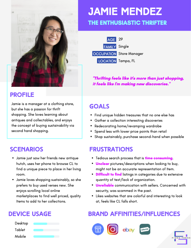
Our UX research and analysis led to the creation of our persona, Jamie Mendez. The following goals and frustrations summarize Jamie’s intentions and pain points while browsing Craigslist:
Jamie’s Goals:
- Find unique hidden treasures that no one else has
- Redecorating home/revamping wardrobe
- Spend less with lower price points than retail
- Shop sustainably, purchase second-hand when possible
Jamie’s Frustrations:
- Tedious search process that is time consuming.
- Unclear pictures/descriptions when looking to buy, might not be an accurate representation of Item.
- Difficult to find listings in categories due to extensive quantity of text/lack of organization.
- Unreliable communication with sellers. Concerned with security, was scammed in the past.
- Likes websites that are colorful and interesting to look at, feels like CL falls short.
05. Problem Statement
“ Jamie, the enthusiastic thrifter, needs a trustworthy, reputable, and organized platform to purchase antiques online so that she can easily find authentic pieces that match her personal style on a budget. ”
06. Approach
Our approach included the following phases and deliverables:
Discovery
UX Handoff Summary
Visual Competitive Analysis
Ideation
Moodboards
Style Tiles
Production
Hi-Fi Screens
Discovery
UX Handoff Summary
Our prior UX work led to a focus on the hierarchy of elements and secure interaction to improve a user’s buying journey through the site. Jamie’s user flow prompted the creation of 4 screens:
Given the time constraint, I limited the scope of work to focus on the most important features applicable to Jamie:
- Improving the hierarchy of elements for visibility
- Creating a secure method of user interaction
- Implementing clear and uniform listing organization across all pages
Visual Competitive Analysis
My team and I conducted a thorough visual competitive analysis to understand Craigslist competitor’s design choices. This in combination with UX research and testing allowed us to have a unified understanding of our problem and begin to explore solutions on an individual basis.
Our team summarized competitor important considerations to implement into our designs:

Key insights
We found the following common design themes amongst Facebook Marketplace, Offerup, and Wayfair to consider in our design:
- Familiar & Simple Icons
- Messaging System
- Readable Fonts (typically Sans-Serif)
- Sophisticated Color Palette
- Clear Hierarchy of Elements
With these findings, I shifted my focus towards ideation. Before creating high-fidelity screens, I explored aesthetics with moodboards and style tiles for guidance.
Ideation
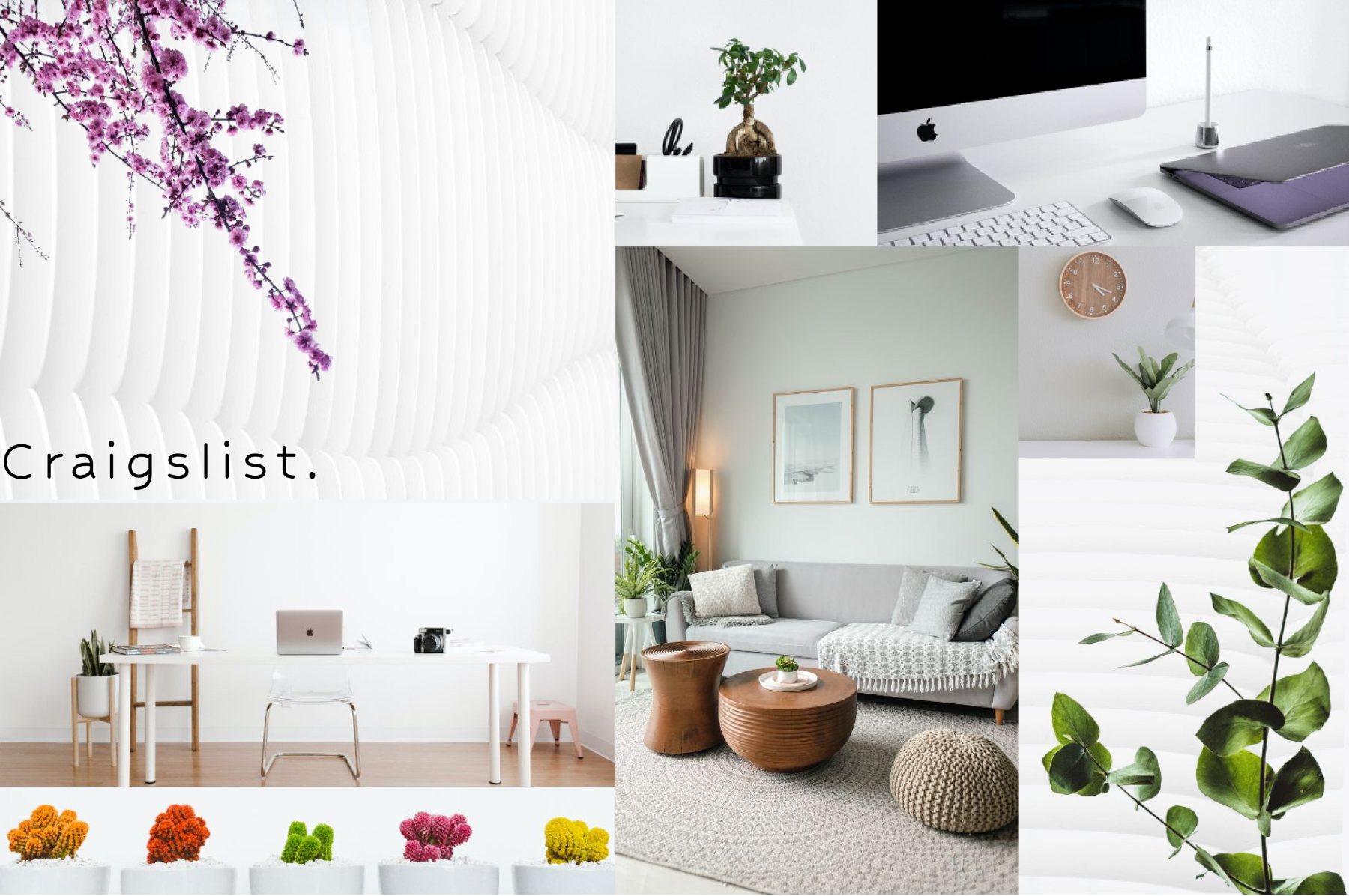
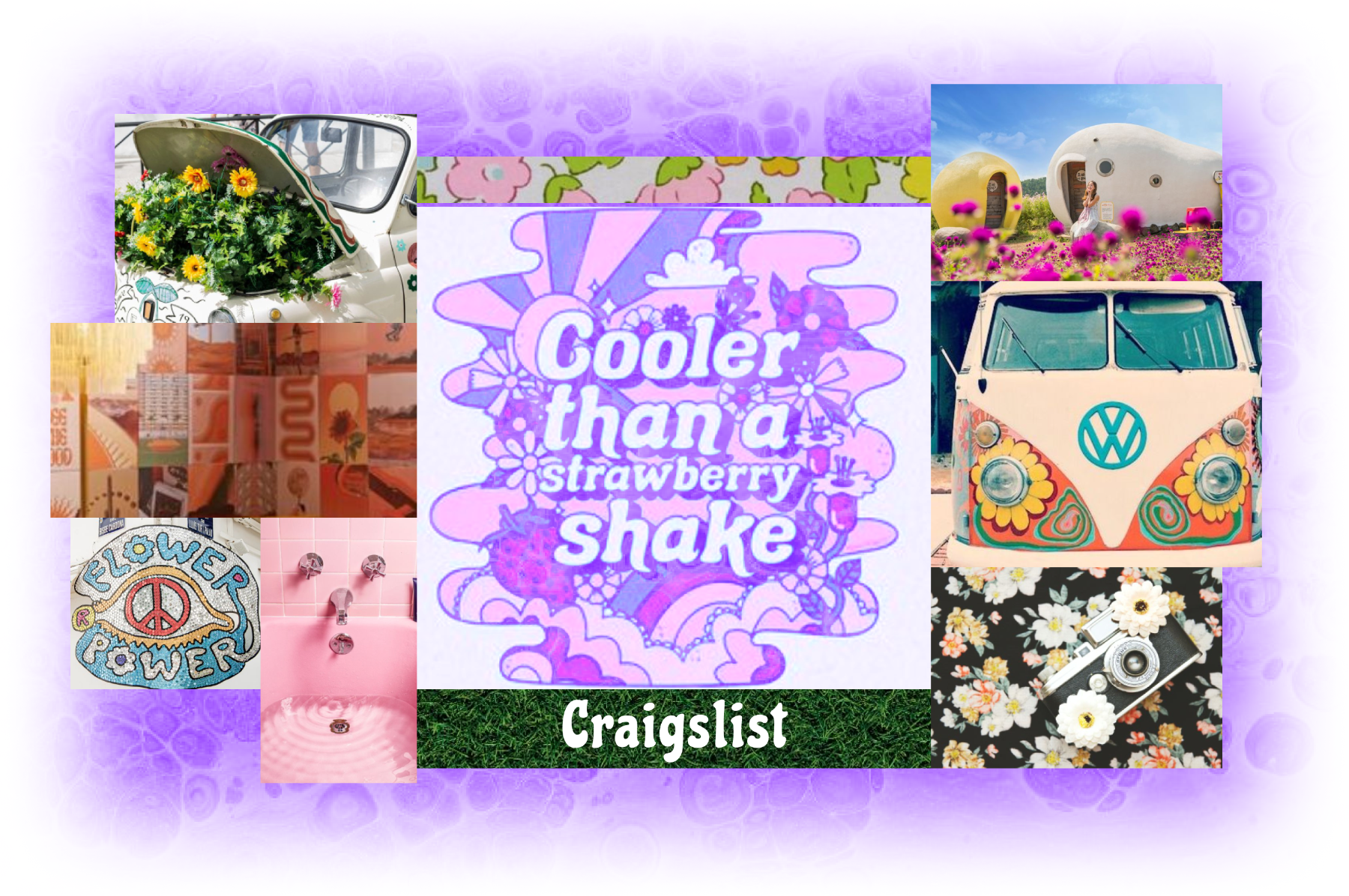
Moodboards
I created 3 moodboards to experiment with different visual styles to begin visual design exploration. My strategy was to consider Jamie’s desire for more color and utilize a color system that would help emphasize page elements. Jamie is looking for a more clear, visually impactful, and interesting interface.
Style Tile
Based on feedback and design considerations, I moved forward with a vintage inspired moodboard to create a style tile.
This allowed me to tie in Jamie’s interests with the style and original branding of Craigslist.
In order to pull away from an overly feminine design, I adjusted my color palette to include green, yellow, and orange.
To compliment this retro design, buttons and cards all have rounded corners.
Buttons were first yellow but for accessibility reasons it was hard to read. I change them to be a slightly darker color to add contrast. Choosing a white interface complimented by bright pops of color that do not pull overly masculine or feminine.
For the most part, the competitors we analyzed stuck with a san serif font and simple/clean icons which I carried over to my design

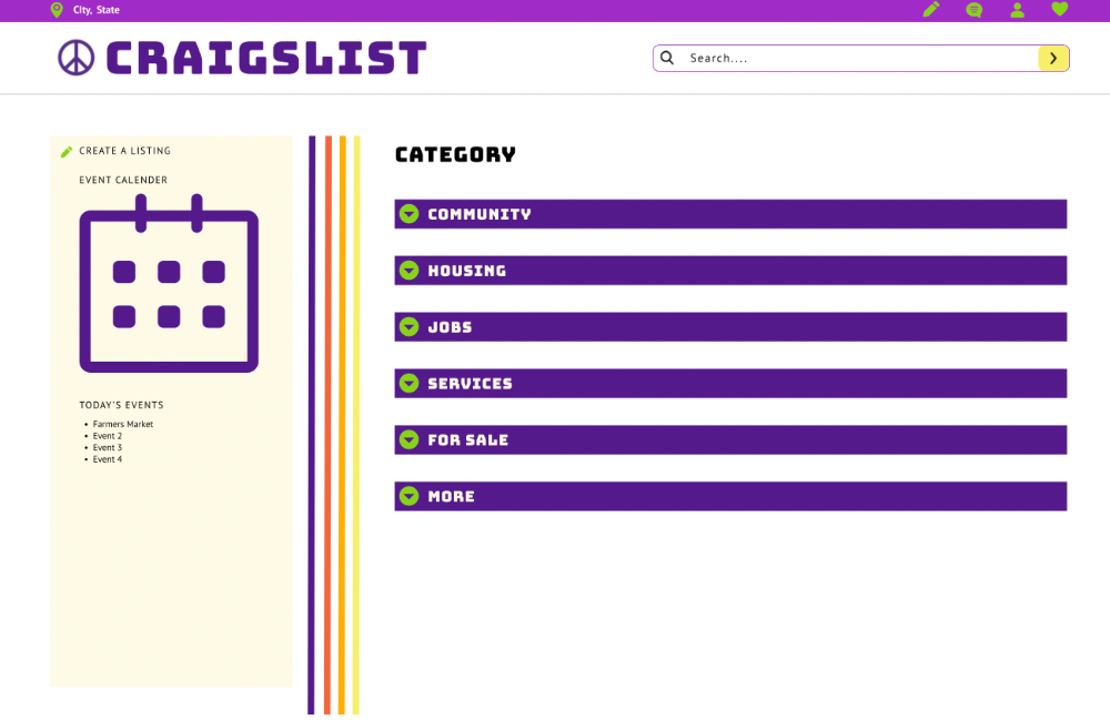
I focused on creating a clear content hierarchy by using the deep purple fill to emphasize the categories.
Next I wanted to create a consistent listing page layout with a large space for images since we discovered this is what the user typically looks at first in our research. I added some icons to help break up the text and lines to distinguish different areas of content.
07. Solution
After designing the Hi-Fi screens, I conducted an additional round of user testing to iterate and improve my designs.
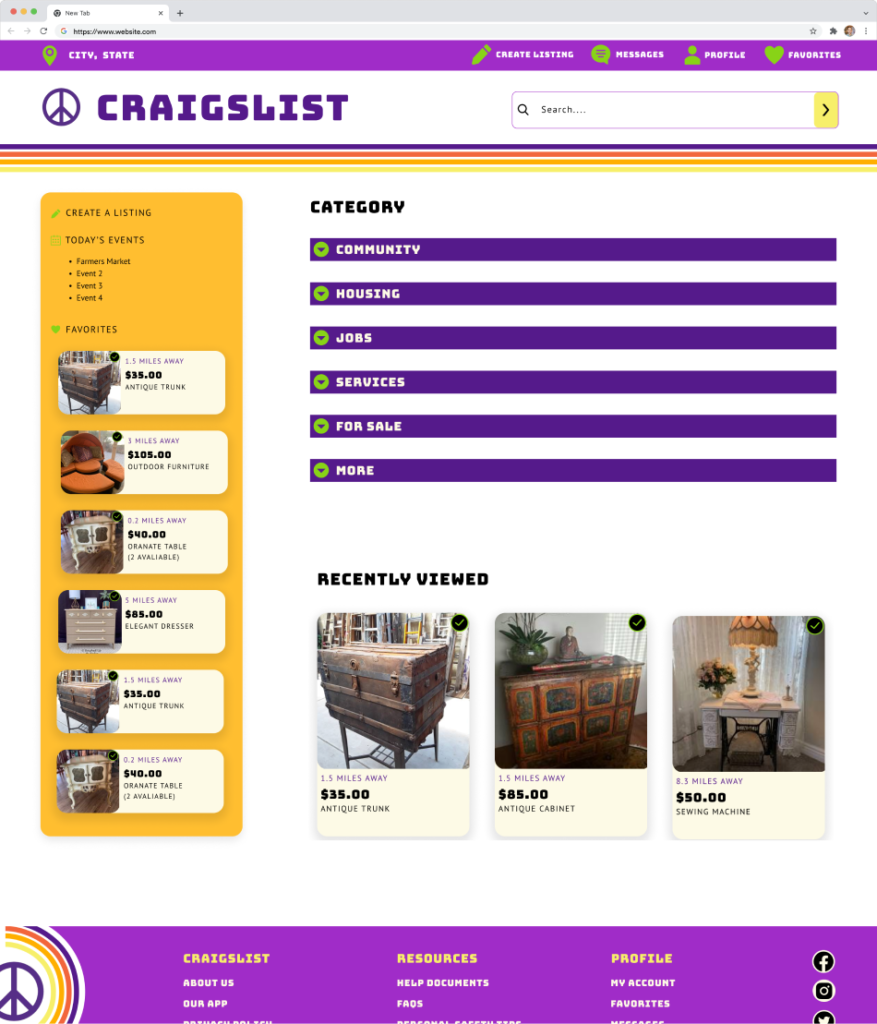
I rearranged the sidebar and included a “Favorites” tab to help customize Jamie’s experience. There is also a recently viewed section below the categories for easy access along with a footer section with quick links. I kept an emphasis on the categories and added drop down functionality to display subcategories.
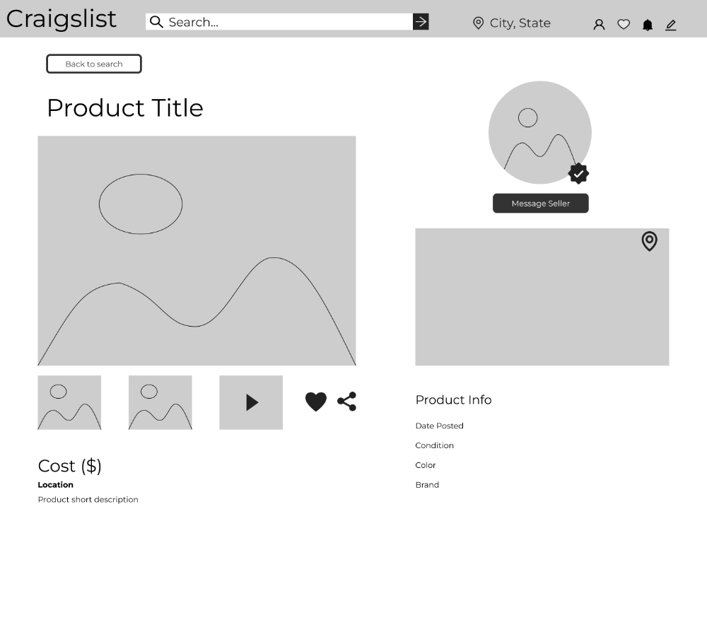
Jamie, being an antique thrifter, would navigate to the “For Sale” tab and select “Furniture” from the drop down.
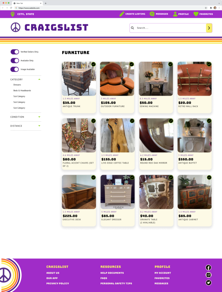
On the search page I chose a 4 column listing view to clearly display images and avoid cluttering the space. I also added a mockup filter sidebar with toggle interactions for easy filtering of preferences.
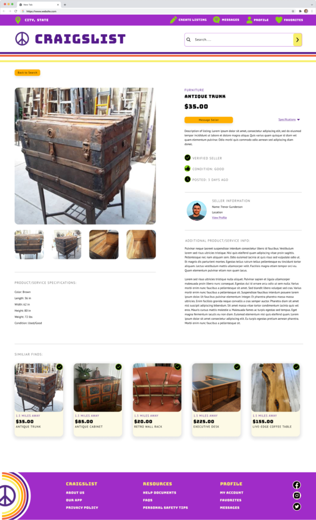
Let’s say Jamie really likes the Antique trunk, when she clicks on it it will bring her to the listing page. Here she can easily see the item’s cost, description, and seller’s information. There is also a “Similar Finds” section at the bottom to provide related listings.

Jamie wants to know who the seller is, so she clicks on the seller’s profile to learn a little more about Trevor. She can see reviews of other CL users who worked with him and other listings he has available.
Now that she feels comfortable, she goes back to the listing page and clicks “Message Seller” which pops open a chat window. She can minimize this window and it will stay at the bottom of her screen for easy access. If she wants to access her messages later on, she can click on the messages tab in the upper header which pops open all her past messages.
08. Outcomes
Overall, my redesign of Craigslist was successful. The primary objective was to create a simplified and modern layout that is familiar to users. I was able to address the primary user’s pain points and create a modernized interface that proved to be intuitive and ease user fatigue.
The end design successfully improved the most impactful features for our Persona:
- Improving the hierarchy of elements for visibility
- Creating a secure method of user interaction
- Implementing clear and uniform listing organization across all pages
Future considerations
- Iterate on the home page designs through testing user desirability and incorporating feedback
- Finish out and formalize message notifications
- Add views and functionality for a “View product in home” function to help users visualize items in their space
Reflections
This UI project gave me experience in prioritizing the most valuable work to complete for the user. I also learned the importance of designing for all users, and not just our Persona’s taste.